Hi there Datadog design team!
I am SUPER excited about the prospect of joining Datadog, especially after I got to meet so many of you! Here is a bit more of my work for you to all see.
I give some context below, but my intent here is not to show you how I solved these problems. I intend to share the raw assets of my work so that you may inspect them.
A summary of what is below:
- A complete design system with typographic rules, colors, states and components
- The usage of the above design system to produce UI's for three different experiences all part of the same product suite
- A redesign of an interactive media product
- The setup of a design system in code
- My favorite UI invention :)
HSS Design System
This design system was put together for the Hospital for Special Surgery. Their Chief Venture Officer is investing in a new experience for patients, doctors and hospital staff to interact with each other for their surgical needs.
The patients using this system spanned the spectrum of age and technical ability and needed to be usable across that entire spectrum.
The data that needed to be collected from the patients needed to be presented to doctors concisely, optimizing for speed of access and not necessarily usability.
The hospital staff needed to manage and create many types of surveys with particular language that had been validated by medical researchers.
UI/UX Redesign
I have been working with a client that has an odd product called VoiceThread. The company has been around for 9 years, and has revenue in the millions...and yet the product violates almost everything we know to be good design.
The company has identified it's lack of good design as a barrier for growth and they hired me to help solve it.
Solving their design problems has a few dimensions to it that must be considered:
- They only have two release cycles per year due to contractual agreements with their customers
- The organization has a culture of not respecting good design practices
- Front end developers at this company are not communicative, and if lacking information will make design choices on their own
- A culture of reasoning and concluding about customer behavior without research
I give the above context because the design I present to you below is the result of having worked through all of the challenges above over many months.
The company is incredibly nervous about touching the design of their core product, and the fact that I have been able to execute a complete redesign is a success.
- User flows - (figma - sign up for a free account to inspect file more closely)
- Design file - (figma - sign up for a free account to inspect file more closely)
- Organize slides - (prototype'ish - entire artboard is one hotspot for each screen to demonstrate a flow)
- Drag and drop files to upload - (prototype'ish - entire artboard is one hotspot for each screen to demonstrate a flow)
Design system in code
The front end development challenge I described in the section previous to this one was substantial due to some communication issues that are not easily solved. So to avoid poor implementations of design I created all of the components designed by me in HTML & CSS.
I then worked with the developers on a build process that would pull in all of this markup and styling code so that the product would always have the right styling.
As a result, no pixel pushing was necessary from design --> dev handoff and handoffs didn't have to be design files. They could be text documents illustrating the names of components that were to be used.
My favorite UI
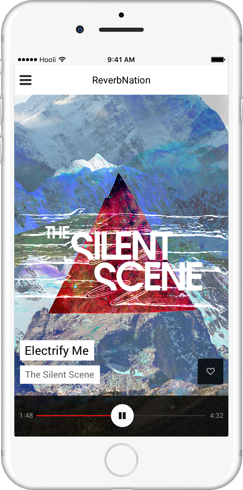
A few years ago I got to work on a blue ocean project to invent a music listening experience.
My favorite thing about this project is the playback controls. At the time most mobile music experiences had a collection of UI elements on the "currently playing" screens that looked like this:
- Cover art
- Next song
- Previous song
- Play / Pause
- Timeline and scrubber
- Song length
- Current time
- Artist name
- Song name
- Volume
This was 2014 and swiping cards were all the rage because of Tinder, and I thought it would be a fun way to interact with a music experience that was focused exclusively on the DISCOVERY of music.
Additionally, if this app was to be about discovery then you may not want to listen to the entire song...but, you might be inclined to skip through it quickly.
LINK: The final UI looked like this
Four of the UI elements were combined into one. The play/pause button was also draggable, allowing for a huge tap target to skip through the song. Additionally, the total number of UI elements was reduced as a result.
Secretly I was hoping all music products would adopt this UI invention, but maybe it's not as awesome as I think it is :)
This project was also the first time I had used Sketch & InVision instead of Photoshop for UI design. I have provided the sketch files below, but keep in mind this was 5 years ago and I was learning how to use Sketch & InVision.
One final note...
This website that you are looking at is 100% custom built and designed by me. It's React and Gatsby, and hosted on S3 with Cloudfront.
This site is ridiculous fast with a 99 rating out of 100 (see the actual report here) for performance by Google, and if I ever ended up at the top of Reddit...it wouldn't flinch at the traffic that it got.
I was really striving for simplicity and good typography (which is an area I am looking to improve upon). If you use your browser dev tools you can see how the 24px vertical rhythm works which I think is pretty cool.